Pantone Color Institute has been announcing ‘it’ colour of the year since 2000
Natalie Stechyson | CBC
The Pantone 2024 colour of the year, Peach Fuzz, was announced Thursday morning. (Michael Marquand/Pantone)
In a countdown so highly anticipated in the design world that it’s akin to New Year’s Eve, the 2024 Pantone colour of the year was revealed this morning. And it is: Peach Fuzz.
The hue is described in Pantone’s media release as “a velvety, gentle peach whose all-embracing spirit enriches mind, body and soul.”
The “warm and cozy shade highlights our desire for togetherness with others and the feelings this creates,” the release said. Pantone also called Peach Fuzz “subtly sensual,” “heartfelt” and described it as “communicating a message of caring and sharing, community and collaboration.”
“In seeking a hue that echoes our innate yearning for closeness and connection, we chose a colour radiant with warmth and modern elegance. A shade that resonates with compassion, offers a tactile embrace and effortlessly bridges the youthful with the timeless,” Leatrice Eiseman, executive director of the Pantone Color Institute, said on the company website.
The colour needed to represent coming together as a community, said Laurie Pressman, vice-president of the Pantone Color Institute, on the website.
“At a time of turmoil in many aspects of our lives, our need for nurturing, empathy and compassion grows ever stronger, as does our imaginings of a more peaceful future.”
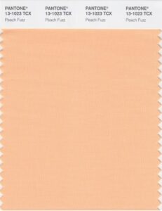
The Pantone 2024 colour of the year, Peach Fuzz, is seen in this swatch. (Pantone)
‘The language of colour’
Those who follow the annual announcement know it’s about more than a paint shade to inspire our design choices — the colour of the year is seen by many as representing the current cultural moment.
The Pantone Color Institute has been announcing the “it” colour of the year since 2000, with its inaugural shade, Cerulean Blue described on its website as mirroring “the colour of the sky on a crystal clear day connoting our desire for peace and relaxation as we enter the new millennium.”
Last year’s choice, Viva Magenta, is described as “a nuanced crimson red rooted in nature encouraging experimentation and self-expression without restraint.”
An unconventional shade for an unconventional time:
a new vision. Color of the Year 2023: PANTONE 18-1750 Viva MagentaVibrating with vim and vigor, a shade rooted in nature descending from the red family demonstrating a new signal of strength.https://t.co/vxEQlBykRT#Pantone pic.twitter.com/pRIP6bI2NH
— PANTONE (@pantone) December 2, 2022
Considering that 2023 was also the year people embraced maximalism, a decor trend that embraces the esthetic of excess, and our current embrace of nostalgia, which has also seen film cameras, DVDs and vinyl records stage a comeback, bold and bright magenta seemed an appropriate choice.
“We wanted to highlight to our audience how what is taking place in our global culture is expressed and reflected through the language of colour,” Pressman said in an interview last year.
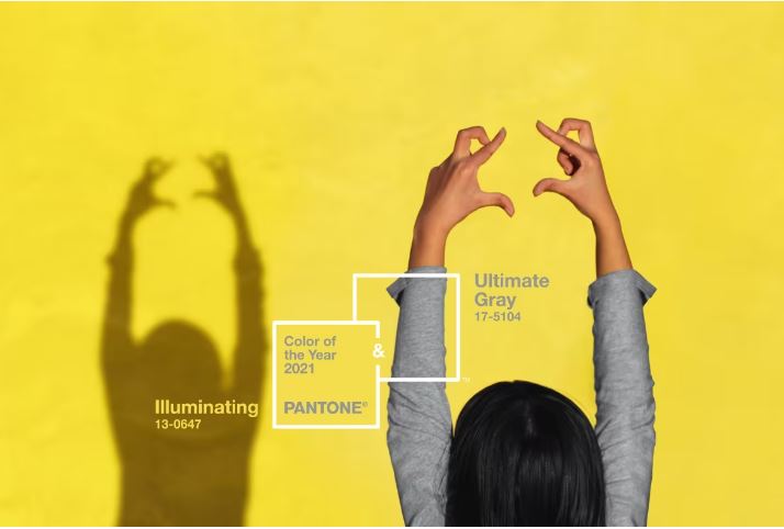
Pantone broke tradition by announcing two colours of the year for 2021: Ultimate Gray and Illuminating. (Pantone)
To decide on the colour, Pressman notes a “global team of colour experts” combs through the entertainment industry, art, fashion, all areas of design, travel destinations, lifestyles, “playstyles or enjoyable escapes” as well as socio-economic conditions to find influences.
The colour is bigger than one region or one sector of design, Pressman added.
“It is a colour we see crossing all areas of design; a colour that serves as an expression of a mood and an attitude on the part of the consumers, a colour that will resonate around the world, a colour that reflects what people are looking for, a colour that can hope to answer what they feel they need.”
On X, formally known as Twitter, some called the 2024 hue a solid pick.
“I believe it is a good choice, a very calm colour in current unstable times,” one user wrote.
All things nostalgia
The colour — and sentiment — seem to fit right into our current embrace of all things nostalgia, vintage and comforting.
Along the same lines, Pinterest’s annual trends report predicts “Kitschens” will be on the rise in 2024, with Gen X and boomers seeking to “quirk up their cooking areas with thrifted finds, vintage appliances and eye-jarring pops of paint.”
Several design magazines and websites have already predicted that peach could replace the extremely popular “millennial pink.”
“In my opinion, the use of peach aligns perfectly with the slow living movement, which embraces a slower pace of life and it’s the antithesis of the bustle of city life,” interior designer and colour consultant Sabrina Panizza said in Livingetc. back in March.
“The slow interiors trend is all about creating a peaceful environment, a calming escape from today’s fast-paced world, that brings harmony and happiness.”