Updated 6:00 PM ET, Wed April 28, 2021
New York (CNN Business) Microsoftis changing its default font for the first time in nearly 15 years, and it wants your help selecting the new one. And no, you can’t vote for the goofy options like Comic Sans, Windings or — heaven forbid — Papyrus.
The company has commissioned five new custom typefaces to replace Calibri, a workhorse of a font that has been the default for all your Word docs and Outlook emails since 2007. Calibri replaced Times New Roman (a noble type family but one with decidedly pre-internet aesthetic).
Default fonts are designed to be unobtrusive and adaptable, and Calibri has served that role capably. It renders well on just about any screen, at any size, but it still has a bit of character. Its subtle curves make it a bit warmer than its blocky sans serif cousins Helvetica and Arial, two designer favorites that are famous — or infamous, in some circles — for their brutal simplicity and balanced stroke weight. (Sans serif means no curly bits at the ends of the letters)
Calibri’s finest attribute, however, is that few people, apart from designers and typographers, even notice it. It’s the tofu of the type world. But after 13 years, Calibri is starting to look a little dated, and Microsoft wants to give your emails and documents a fresh coat of paint.
“A default font is often the first impression we make,” Microsoft wrote in a blog post announcing the change. “It’s the visual identity we present to other people via our resumes, documents, or emails. And just as people and the world around us age and grow, so too should our modes of expression.”
Although Calibri is retiring as the default next year, it will still be available among the hundreds of Microsoft Office fonts.
Here are the five sans serif contendersMicrosoft(MSFT)is inviting you to weigh in on. You can send your favorites on social media to@Microsoft365
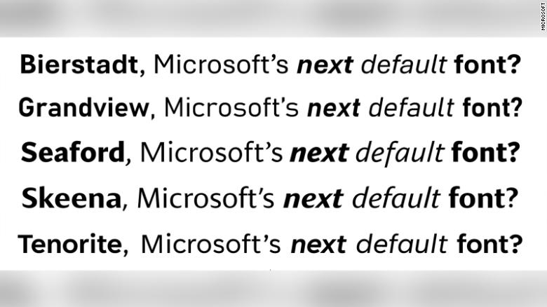
Tenorite
Tenorite looks like a traditional workhorse sans serif font, but a little friendlier. It was designed by Erin McLaughlin and Wei Huang, and notably uses large dots, accents, and punctuation that make it comfortable to read at small sizes.
“We were craving something very round, wide, and crisp,” the designers said in Microsoft’s blog. “We didn’t shy away from going large and circular. In many typefaces, the punctuation is too faint, tightly spaced, or easily confusable for on-screen rendering, where clarity is key.”
Bierstadt
Bierstadt, designed by Steve Matteson, is a precise serif inspired by mid-century Swiss designs.
“Swiss typographers gravitated to grotesque designs like Helvetica because of their suitability for grid-based typography,” Matteson said. (Side note: “grotesque” in designspeak is not derogatory — it just refers to sans serifs.) “In today’s world, I believe a grotesque typeface’s voice needs a bit of a human touch to feel more approachable and less institutional.”
The name comes from one of Colorado’s 14,000-foot peaks. “When I think of Swiss type, I think of the Alps, and since I’m based in Boulder, my Alps are the Rockies,” Matteson said.
Skeena
This sans serif by John Hudson and Paul Hanslow may be the quirkiest of the bunch, while still being compact and readable as body text or presentation titles.
“We wanted to create a humanist sans serif with generous proportions and a higher than usual stroke contrast (also known as the variation in weight between thick and thin parts of the letter),” Hudson said. Skeena’s “diagonally sheared terminals” make it more distinctive.
Seaford
This “gently organic and asymmetric” sans serif by Tobias Frere-Jones, Nina Stössinger, and Fred Shallcrass is like a warm hug, or a cozy reading nook, or a cup of tea. Something makes you want curl up in it. That’s kind of what the designers were going for.
“To pinpoint the kind of familiarity…the typeface should evoke, we also looked at pictures of old armchairs,” Stössinger said. “In chair terms, we were going for a practical interpretation of a beautiful family heirloom; durable upholstery, nothing overtly plushy or nostalgic.”
Grandview
This sans serif typeface by Aaron Bell is derived from old German road and railway signage, which was designed to be legible at a distance.
Its roots in signage give this one a mechanical but sophisticated vibe.
“When I was first asked to create a font that retained the spirit and personality of the German Industrial Standard (DIN) and was more readable for body text, I wasn’t sure it was possible,” Bell said. But with a few modifications, he says Grandview preserves the voice of the original typeface but also works well for long-form text.
How to vote
Choose carefully — this could affect every Power Point presentation you have to sit through for the next decade or more. You can tweet your favorite to Microsoft here.