The Dieline | by Bill McCool on 10/11/2023
No one can read my handwriting.
Maybe because it’s an illegible mess of print and cursive, something that has transformed into my own variety of shorthand that even I can’t decode without taking a few moments to question whatever the hell I was trying to get across, which isn’t ideal when a good portion of your job entails taking notes (gosh bless Otter, the ultimate writer buddy). Somehow, that has also spilled over into my texting habits, which are chockful of misspellings and autocorrects.
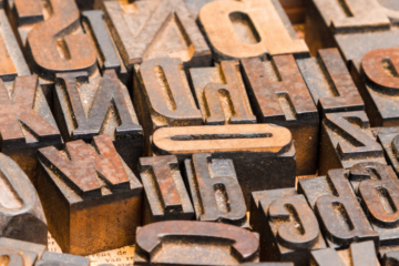
I remember the distinct pain of learning to write in cursive and never quite grasping how to make an uppercase Q, no matter how much I slowed myself down. Mostly, I recall lots of red ink and a handful of impatient elementary school teachers. It’s no wonder that later on, I was immediately skeptical or suspicious of anyone who called themselves a typography nerd or was teaching themself calligraphy. Of course, when you start writing about design, you quickly get over that hangup.
Writing in cursive is something my own children must contend with, but also not really? Cursive was eliminated from the K-12 Common Core Standards in 2010, but over 20 states have since reintroduced it into their curriculum. My home state of Massachusetts is a little iffy around the language, saying that kids should be able to write legibly using print or cursive, so it’s not something that’s enforced. Still, its removal does make an awful lot of sense—should children spend countless hours of methodical practice on getting those lowercase Gs and Qs just right, or instead beef up their typing skills? Or should they just focus on pitch-perfect enunciation for their future AI companion? Writing in The Atlantic on how a majority of Gen Zers don’t know how to read cursive anymore, Drew Gilpin Faust wrote, “The decline in cursive seems inevitable. Writing is, after all, a technology, and most technologies are sooner or later surpassed and replaced.”
Now that cursive is no longer the norm, we can see it fading away from making an appearance in everyday life. Just this week, Fast Company reported that clothing chain Eddie Bauer changed its logo, moving away from its cursive script and opting for a bold sans-serif mark, citing that the kids don’t read cursive these days. The month before, Johnson & Johnson also revealed their brand refresh, moving away from the handwritten founder’s signature for something more “modern.”
My immediate reaction, at least for Johnson & Johnson, was that the move made the brand feel less human, which may not be the best look for someone dealing in medical goods. Eddie Bauer, however, I thought disappeared from malls across America after they went bankrupt in 2009—shows what I know.
What I can say is that both redesigns point to the notion that brand equity might not matter as much as we think anymore, particularly when it comes to chasing down younger consumers. Eddie Bauer has had the same look for the last 59 years. Johnson & Johnson? 137 years. Logos were already well on their way to being flattened on the whole—as it turns out, all that designer ironing was also straightening out (and breaking apart) all of those letters.
The social media app formerly known as Twitter will likely go down as a prime case study in how not to do a rebrand, and while deciphering just what Elon Musk wanted to do—turning X into an app that’s more than just news and piling on the main character of the day—remains much of a mystery to most folks, you can’t deny that he destroyed billions in hardwon brand equity, including the oft-coveted brand name as a verb application.
Similarly, and perhaps even more dumbfounding, was the Max rebrand from HBO Max—HBO being the clear draw concerning pure name recognition. After three years of being a streamer, Warner Brothers simply destroyed HBO Max’s entire brand identity in under 24 hours, taking all of that brand goodwill courtesy of HBO and its six decades of quality programming and flushing it down the toilet. And for what? Because they added Discovery’s catalog and a broader portfolio of content?
Questionable business decisions aside, Max and X are trying to transform themselves into new-ish services, and, at least internally, they had come to believe they had outgrown the parameters of their brand. And I suppose that makes some sense, but they did it without really connecting themselves to what came before. This was no slow evolution—this was ripping your arm off at the bone to get the band-aid off.
While I certainly can’t say that Max and X were overtures done at the expense of winning the hearts and minds of Gen Z, there is something to be said for scrapping your entire visual identity and the recognition that comes with that. It might seem relatively innocuous, but changing the nature of those letter forms is a fairly big deal. Today, it’s Eddie Bauer, but what about Hallmark and Instagram? Or Campbell and Kleenex?
And—shudder—what about Coca-Cola? Because did you see this?
Proud to finally announce our work for @CocaCola, in collaboration with @MrCraigWard, to re-imagine their iconic logo for the next 131 years. Coming soon to a can near you. #branding #typography pic.twitter.com/LClEGdMMHw
— Jules Ehrhardt (@ezyjules) September 27, 2023
There’s obviously nothing serious about this joke Coca-Cola redesign from Jules Ehrhardt and Craig Ward. But if brands like Eddie Bauer are up in arms about how Gen Z can’t read cursive real good, it’s not that difficult to imagine other brands with script logos getting behind this kind of sentiment. If the youngest demographic you’re catering to says that connecting letters makes their brains hurt, then you might start questioning whether it’s time for a makeover.
Also, let’s not shit ourselves here. Coca-Cola isn’t changing that iconic logo any time soon.
“I keep hearing this ‘cursive isn’t taught anymore,’ as if that’s a real reason to change cursive logos,” says Alex Center, founder of the Brooklyn-based design and branding company CENTER. “So you’re telling me that in the future, people won’t be able to read Coca-Cola, Disney, Budweiser, or Cadillac? We should change them all? 100-plus years of brand recognition? Who needs it?”
“And while we’re it, let’s get rid of logos with typewriter fonts too,” he continues. “I heart NY, see ya’. Why not get rid of blackletter logos, too? The New York Times or Juicy Couture? Let’s get those changed because in the future, it’s looking like sans-serifs are all we need.”
“I think it is lazy, unoriginal, and as soulless as the generic private-label brands of the 1970s,” says Debbie Millman, host of the Design Matters podcast, of the recent un-scripted refreshes.
Not to defend the san-serifing of logos, but it’s not like this is without precedent. Whole languages die, and the means of recording them evolve. We do lose something in the process of that, that connection that tethers us to the past, particularly when we start to overlook the immediacy of something written by hand. Autograph hounds, after all, aren’t asking for a celebrity’s email signature. But when we lose the physicality of writing or the pomp and circumstance of a handwritten note, there is a devaluation of what once seemed so personal and concrete. And, in some ways, you can say the same thing about some of the most enduring logos that have taken up valuable real estate for our eyeballs.
My oldest child learned to write in cursive in the third grade, but they’re also not required to use it daily. There are no book reports with letters painstakingly bound between the lines. It’s up to them if they want to use it or not. And if you’re not using it, well, what’s the point? That’s gone—that’s an antiquity, a landline, or a dial on a television. Which is all to say that if you’re a budding historian, it might be time for a YouTube tutorial on fancy letters because you’ll be at odds with primary sources for the entirety of your career.
Whether we like it or not, language and the very nature of how we communicate are constantly changing and shifting. One day you’re writing a thank-you card; the next, you ask ChatGPT to do it for you instead. And with the birth of another as-yet to be born generation, even that might not matter much at all.
Sadly, it might be time for cursive to read the writing on the wall.