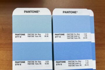
Your business card is a powerful tool to make a lasting impression on potential clients, partners, and employers. But how do you choose the best colors for your card that reflect your brand, personality, and industry? In this article, we’ll show you some tips and examples of how to update your business card color to match the current trends and styles in graphic design.
Why color matters
Color is one of the most important elements of visual communication, as it can evoke emotions, convey messages, and create associations. The colors you use on your business card can influence how people perceive you and your business, and whether they trust you or not. For example, blue is often associated with professionalism, reliability, and trustworthiness, while red can suggest passion, energy, and urgency. Therefore, you should choose colors that match your brand identity, values, and goals, as well as your target audience’s preferences and expectations.
How to follow the trends and styles
Graphic design is a dynamic and ever-changing field, and the trends and styles of colors are constantly shifting. To keep your business card looking modern and relevant, you should be aware of the latest trends and styles, and incorporate them into your own design. Minimalism is a popular choice, using simple and clean colors like black, white, gray, or pastels to create a sleek and elegant look. Gradients are also popular, using smooth transitions of colors to create a sense of depth and movement. Metallics are a luxurious and sophisticated choice, using shiny and reflective colors like gold, silver, or copper. And neons are a fun and energetic option, using bright and vibrant colors like pink, green, or yellow.
How to match your industry and niche
Another factor to consider when choosing colors for your business card is your industry and niche. Different industries and niches have different expectations and conventions when it comes to colors, and you should respect them to avoid confusion or misunderstanding. For example, if you are a lawyer, you might want to use more conservative and formal colors, such as navy, burgundy, or beige, while if you are a florist, you might want to use more playful and creative colors, such as purple, orange, or green. You can also use colors to differentiate yourself from your competitors and stand out from the crowd, as long as you don’t compromise your credibility and professionalism.
How to test and print your colors
Before you finalize and print your business card, you should test and preview your colors to make sure they look good and accurate on different devices and materials. You should also be aware of the differences between RGB and CMYK color modes, and how they affect the printing process. RGB stands for red, green, and blue, and it is the color mode used by digital devices, such as monitors, cameras, and scanners. CMYK stands for cyan, magenta, yellow, and black, and it is the color mode used by printers, as they mix these four colors to create other colors. To avoid color discrepancies and errors, you should convert your colors from RGB to CMYK before printing, and use a color profile, a set of rules that define how colors are displayed and printed, to ensure consistency and quality.

