What does overprint mean, and when should I use it?
Overprinting is a process of printing one color on top of another. When you set an object to overprint it will overprint any other object below it.

Automatic trapping in InDesign—either as built‑in trapping or Adobe In‑RIP Trapping—nearly eliminates the need for manual overprinting. However, manual overprinting can be an effective solution in the rare cases when you can’t use automatic trapping.
Overprint is great when the artwork doesn’t share common ink colors and you want to create a trap or overlaid ink effects. When overprinting process color mixes or custom colors that don’t share common ink colors, the overprint color is added to the background color. For example, if you print a fill of 100% magenta over a fill of 100% cyan, the overlapping fills appear violet, not magenta.
Another example of when you will want an object to overprint is if you are creating a varnish in your artwork.
See InDesign Help for more information on overprinting, trapping, and knockout.
What is the difference between “cover” weight and “text” weight?
Paper weights can be very confusing. This is not technical, but we will associate common weights with everyday items you may come in contact with!
There are two basic weights, TEXT WEIGHT and COVER WEIGHT. These two identifiers are probably the most important factors when you are choosing paper for your project. TEXT WEIGHT comes in varying weights/thicknesses, but will have a touch like a ‘letterhead’ paper you may have in your office. COVER WEIGHT comes in varying weights/thicknesses, but will have a touch like a business card or postcard.
Magazines are often assembled using a text weight on the inside pages, and a cover weight for the cover.

What is a spot color?
The most common method of achieving color in printing is referred to as CMYK, four–color process, 4/c process or even just process. To reproduce a color image, a file is separated into four different colors: Cyan (C), Magenta (M), Yellow (Y) and Black (K).
During separation, screen tints comprised of small dots are applied at different angles to each of the four colors. The screened separations are then transferred to four different printing plates, one for each color, and run on a printing press with one color overprinting the next. The composite image fools the naked eye with the illusion of continuous tone.
In offset printing, a spot color is any color generated by an ink (pure or mixed) that is printed using a single run. Colors created without screens or dots, such as those found in the PANTONE MATCHING SYSTEM®, are referred to in the industry as spot or solid colors. From a palette of 18 basic colors, each of the spot colors in the PANTONE MATCHING SYSTEM is mixed according to its own unique ink mixing formula developed by Pantone. You probably mixed yellow and blue paint to get green in your youth. Creating a PANTONE Spot Color is similar in concept, but with the added need for precision.
Why do saddle-stitch booklets have to be in increments of 4 pages?
It has to do with the bindery method that you have chosen. If you are printing a piece that is saddle stitched you need to have a page count based on four pages to fill the spread count. Each spread is made up of four pages. If, for example, your booklet size is 8.5×11 – then it is comprised of 11×17 spreads. There are 2 pages (front and back) of each spread equalling 4 pages.
With a saddle-stitch book we can’t have missing pages, pages can be blank, but they must be in your layout. Acceptable layout page counts are: 4, 8, 12, 16, 20, 24, 28, etc.
What is page creep?
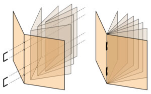
Saddle stitching can be susceptible to a phenomenon called “page creep”, which occurs when the inner pages stick out of the edge of the booklet, as compared to pages closer to the outer cover. When the edges of the booklet are trimmed flush after stitching, the width of the innermost sheet will be narrower than the outermost sheets.
 Before Trimming:
Innermost pages stick out past the edge of the booklet.
After Trimming:
The pages are trimmed flush for a clean edge.
Page creep also results in the printed area of each page appearing to get closer to the outside margin as you flip towards the center of the book. The margin is an important consideration for page numbers and content that is typically close to the edge. A good outside margin would be 1/4″ – 3/8″. Booklets with more pages or those with cover weight pages will want to consider a 3/8″ margin. Knowing about this margin slide during the designing process can help you to reduce the impact of page creep.
Do you have in-house bindery?
Yes. In fact, we can do many types of die-cutting and embossing in-house as well. This is a price-savings advantage and can shorten turnaround times.
What are your maximum sheet sizes?
For offset, our maximum sheet size is 20×28. Our digital presses can print up to 14×26.
What’s the difference between coated and uncoated paper?
Coating is a process by which paper is coated with an agent to improve brightness or printing properties. By applying PCC, china clay, pigment or adhesive the coating fills the miniscule pits between the fibres in the base paper, giving it a smooth, flat surface which can improve the opacity, lustre and colour-absorption ability.
Coated Paper: Coated paper has a glossy or matte/silk finish. Coated paper is generally very smooth and can be either very shiny (high gloss) or have a subtle shine (silk or dull). Coated paper is more resistant to dirt, moisture and wear. It also makes the printed material more shiny. That is why it is generally used in the printing of magazines, book covers, glossy photos and art books. Coating restricts the amount of ink that is absorbed by the paper and how the ink bleeds into the paper. This is desirable for sharp and complex images as the ink stays on top of the paper and will not wick or bleed reducing the sharpness.
Uncoated Paper: Generally more absorbent of ink than a coated paper, like its namesake, uncoated paper does not have a coating. It is generally not as smooth as coated paper and tends to be more porous. Uncoated paper is generally used for letterhead, envelopes and printed material that is aiming for a more prestigious or elegant look. College and University booklets, real estate brochures and menus for elegant restaurants are generally printed on uncoated paper to give them a prestigious feel.
Do you have price lists?
No. Each job is custom quoted based on your specifications. We pride ourselves in providing fair and consistent pricing for the service and workmanship we provide. We are a volume-discount printer – when getting an estimate, ask to see various quantities to see price breaks.
What is your minimum order quantity?
We do not have a minimum order quantity for any job. We are a volume-discount printer. For example – you may choose to print 10 booklets, but the unit cost will be extremely high versus 100 (for example).
What is long grain and short grain in terms of paper orientation?
A paper’s grain is the direction in which most of the fibers lie. Grain is determined during the papermaking process, when fibers tend to align in one direction or the other. Paper is identified as either grain short (grain is parallel to paper’s short side) or grain long (grain is parallel to the paper’s long side), depending on how the paper is cut.
BOND always takes paper grain into account when quoting and producing your job. Documents should always be folded with the grain, and never against. Even an order of business cards will be produced with grain in mind.
What’s your turnaround time?
There is no easy answer for this – the best thing to do is talk to your Account Manager who will be able to most accurately gauge turnaround time depending on what’s happening with our presses and in the bindery. Generally, however, digital is between 24-36 hours and offset is 5-8 days after proof sign-off.
What does 4/4 mean?
A blank side or no printing is represented by 0. Thus 4/0 would signify full color printing on the front side (CMYK) with the backside being blank. 4/1means full color front and 1 ink on the back (usually K or black). 4/4 means full color on both sides.
What’s the difference between offset and digital?
Offset
The Printing Press the traditional method for printing was invented by German Johannes Gutenberg in the year 1450. Its a process by which ink is rolled on to paper and rests on the surface as well as being absorbed into the paper. This process is my preferred choice because its gives me the most accurate control of color, variation of color and paper weight.
Pros
- Allows the most wide range of color re-production. Bright florescence, Pantones®, metallics, foils and varnishes can all be produced using this method of printing.
- Allows the most accurate color re-production and consistency
- A wide variety paper weights, size and textures
- Adjustments to ink density
- Better quality inks
- Large print runs can be reproduced and extremely quickly
Cons
- Setup time is slower and a lot more production steps are required
- Cost of printing low quantities (under 500 copies) can be more expensive
- You can not just print out one copy
- Drying time is considerable
Digital Printing
Originally invented as a pre-press digital proofing system, it was designed to emulate the final printing press results giving customers an idea of what their final printing press project would look like. The process eventually evolved into an alternative printing solution. Commercial digital printers do not look like your standard office copier – they are referred to as digital presses and can print 14×26 image area.
Pros
- Short turn around time, quick, no drying time for inks
- Affordable, cost effective solution for small print runs under 500 copies
- Can be printed onto a variety of mediums
- Newer digital presses rival offset quality
- You can print out just one copy – a representative hardcopy proof
Cons
- Larger quantities exceeding 500 copies can be more expensive
- Pantone® colors can not be reproduced accurately
- Can not reproduce metallic inks, foils or varnishes
- Weight of paper is limited and size of paper in most cases
- Ink is not not absorbed into paper – the toner, rather, sits on top of paper and makes it more susceptible to cracking
My file is very large – how do I send it to you?
If you are unable to email your file to your Account Manager, you can send it by Dropbox, WeTransfer, Hightail, or our file upload feature.
What kind of file should I send you?
We prefer a high-resolution, print-ready, pdf. For multiple pages, please send single-page spreads with crop and bleed (and not reader or printer spreads).
If you do send Indesign files, make sure you package and zip all links and fonts to go with it.
What is bleed?
Bleed is a printing term that is used to describe a document which has images or elements that touch the edge of the page, extending beyond the trim edge and leaving no white margin. When a document has bleed, it must be printed on a larger sheet of paper and then trimed down. See our document on creating and exporting bleed in InDesign.
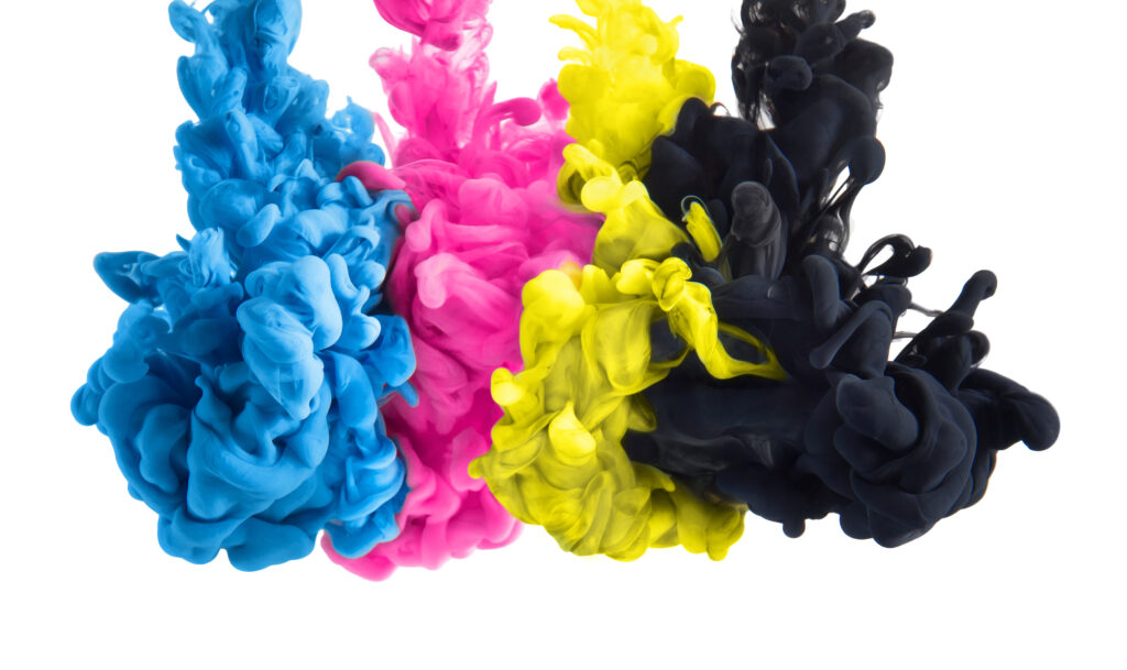
What is the difference between RGB and CMYK?
RGB refers to the primary colors of light, Red, Green and Blue, that are used in monitors, television screens, digital cameras and scanners.
CMYK refers to the primary colors of pigment: Cyan, Magenta, Yellow, and Black. These are the colors used for printing.
Colour shifts are usually not visible in colour photographs. However, rich and solid colours (like a background) can be affected by a colour conversion. Most of the time, colour shifts are minor and may not be noticeable. However, for consistency, you should convert your RGB files to CMYK before printing – that way there are no surprises, and you can also adjust CMYK colors if necessary before printing.

What’s the difference between raster and vector?
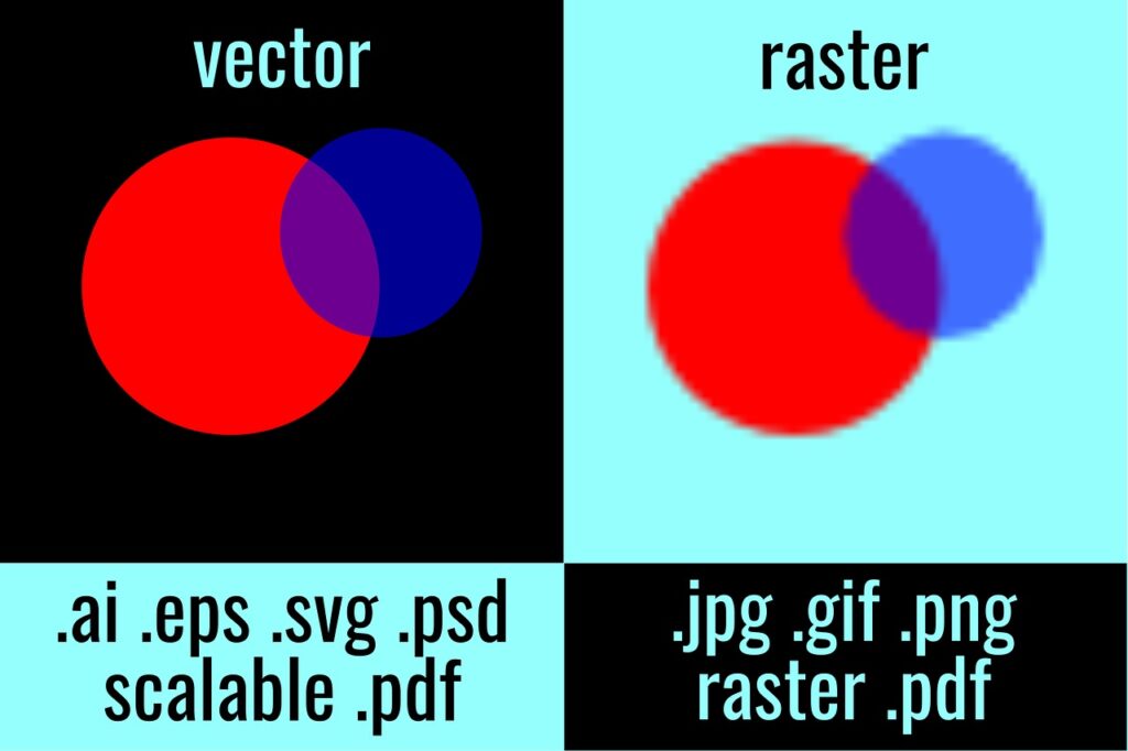
Raster simply means bitmapped, which is a grid of pixels on your screen or printer spots on paper. Pixels can be black or white, shades of gray, or various colors. Bitmaps, recognized by file extensions like TIFF and JPEG, become pixelated when enlarged, showing visible squares. Raster art should be scanned or created at 300dpi at 100% size to maintain quality. Regardless, it’s crucial not to enlarge raster files.
On the other hand, vector art is made up of lines and curves, not pixels or printer spots. Unlike raster art, vector art can be enlarged or reduced without losing the crispness of its lines. Vector files can be recognized by the “EPS” suffix, vector art, created in programs like Adobe Illustrator.